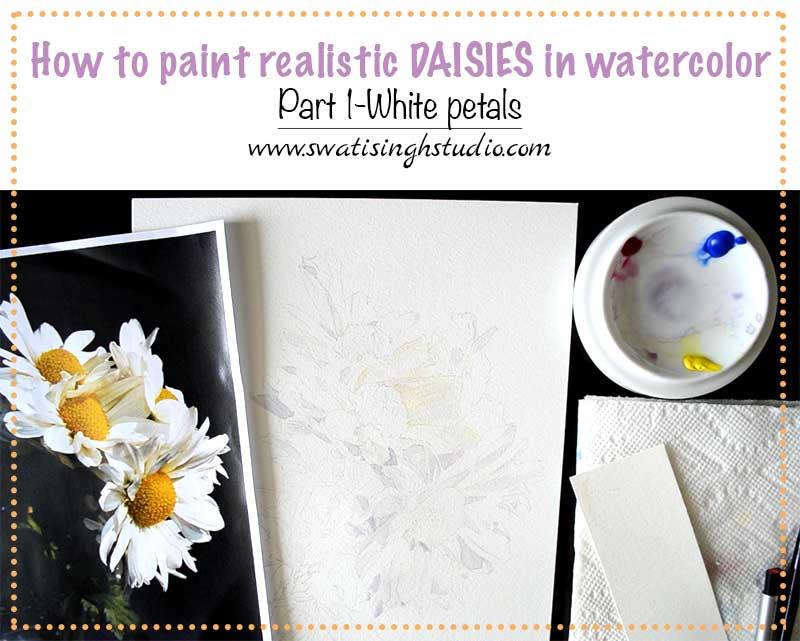
Hello, my lovely artists, hope you all are doing great! Oh boy, does it feel amazing to type this blog post after so long? You bet it does! Firstly, I must thank you all for being so patient with me all this time amidst all the studies and exams. Well, I am happy to let you all know I passed my final exam with flying colors and I am a Graduate Gemologist now. Yayy! I know. What a feeling.
Well, I will not lie here but I took a good one month break after my exam to just be lazy and plan the next few months. And here I am, with a surprise for you all. My Youtube channel.
Finally, I gathered all my focus and concentration back and made a 4-part series of a white daisy tutorial for you all. I did not want to overwhelm you with all the elements in one big tutorial. Breaking down the tutorial will make it easier for you to practice at your pace and keep up with me at the same time.
THE COMPOSITION
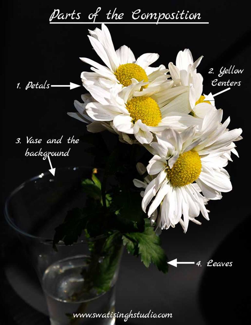
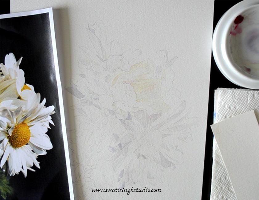
Above you can see the picture I took of a beautiful daisy bouquet I purchased a few days back.
To make the white petals stand out enough, I photographed them against a black background. I will not certainly paint the background black but a dark background does make a difference in the overall beauty of the daisies.
Today I am demonstrating the first part of the series- The white petals.
I am so excited to be finally making videos as I know how much easier it will be for you to understand all the key steps involved in painting this subject.
Although you can see me paint in the video, I am still breaking down the tutorial in a few important steps that you might find helpful.
The colors I used are:
1. Cobalt blue
2. Permanent Rose and
3. Lemon yellow
Brush used: A #4 round brush that comes to a fine point. You may use a separate #1 brush for fine details if your brush has lost its point.
HOW TO MIX COLORS TOGETHER
When we paint a white subject in watercolors, we paint the shadows that we see on the subject. Hence, in this PART1 of the Daisy series, we will practice a lot of color mixing for the shadows.
By mixing the three colors listed above we can create endless possibilities of gray shadow mixes. This is done in two ways:
a. By varying the proportions of each color in the mix.
b. By varying the tonal value of the mix by adjusting the amount of water added to it.
Below you can see a graded chart I made for you to understand the two points better.
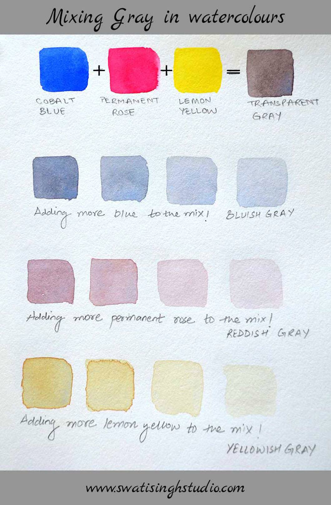
Now, why do we need to adjust the three colors you may ask. Because all the shadows are not of the same color. If you look closely you will find them a bit different in color from each other with a dominant color hue.
Similarly, we need to paint different tonal values to suggest soft shadows and strong shadows.
So, let’s get started!
YELLOWISH SHADOWS
Step1. Start by preparing the mix for yellowish shadows. Add just a tiny amount of permanent rose and cobalt blue. Make sure to add enough water to dilute the mix.
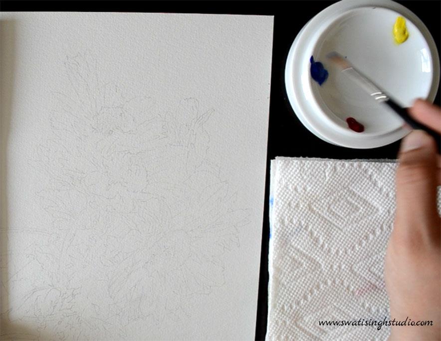
Tip: Wash your brush in between each color to keep your pigments clean. Also, dab your color loaded brush on a tissue paper to get any excess color out.
Tip: It is always a better idea to check the shade on a separate sheet of watercolor paper before applying it to the fair drawing.
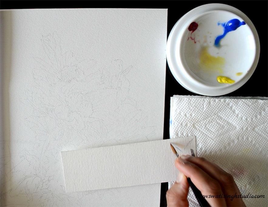
Once you get the right shade start on the lightest of shadows.
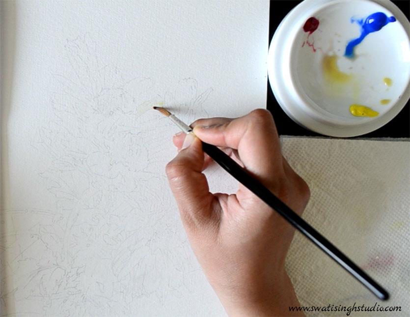
Step 2. WET ON WET
a. When covering a larger area of the petal start by applying a clear wash of water to the area first.
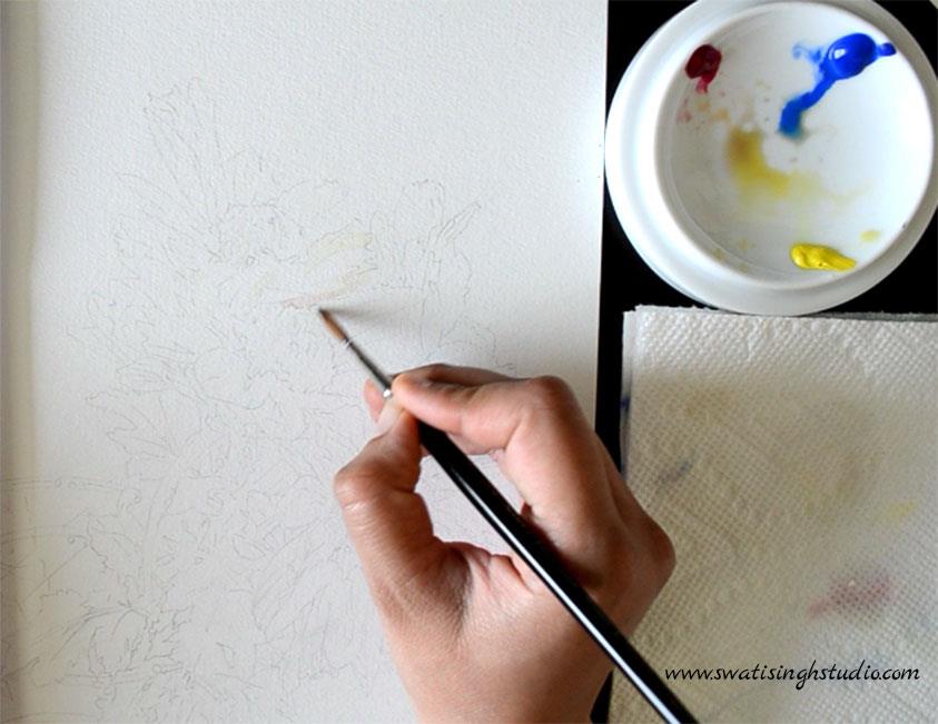
b. Once the sheet is semi-dry start dropping the color in and even it out with your brush to prevent the formation of any hard lines.
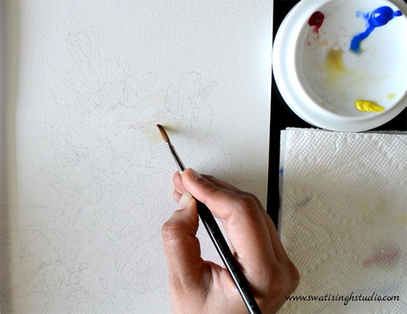
Step 3. Keep an eraser handy just in case you want to tone down any dark pencil lines before applying any color to the sheet.
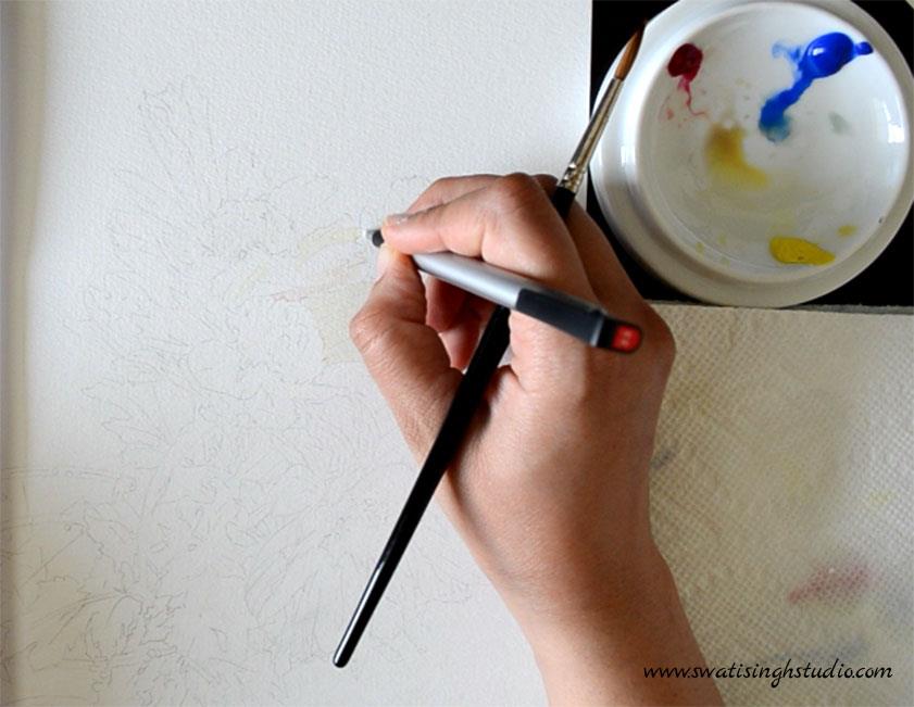
Step 4. Now, make some fine lines to suggest veins in the petals with a slightly darker shade of the same mix.
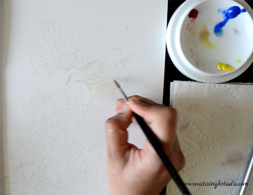
BLUISH SHADOWS
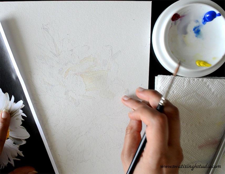
Step 5. Dilute the blue mix and apply by keeping the brush flat on larger areas as shown below. This will help cover a large area of a petal at once.
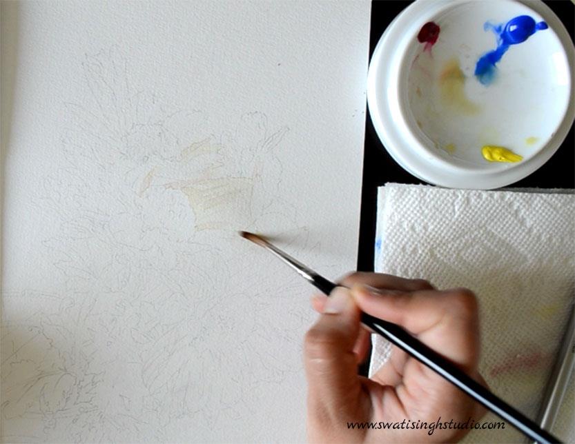
Step6. Now, use the tip of the brush to create very thin border lines between the individual petals. This helps in defining the petals better. Just keep in mind to use your thin brush for this purpose.
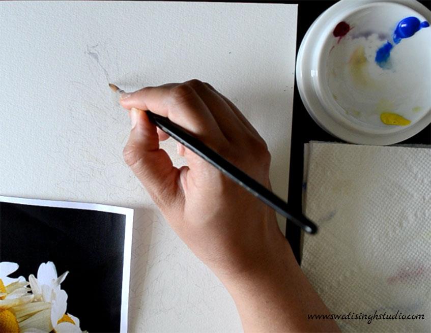
Tip: Sometimes I use the tip of my finger to gently smoothen out any harsh lines while the color is still wet on the sheet. Simply, dab the tip of your finger to lift off any excess color puddles. This can only be done when the color is dilute enough otherwise there is a high risk of leaving a fingerprint on the paper with darker tones. You may use a facial tissue if you are not confident yet.
PINKISH SHADOWS
Step 7. It is very important to dilute your pink mix sufficiently to avoid any staining on the sheet. Permanent Rose is a staining color and it is hard to lift off once put on the sheet. After all, we want our petals to look white and not pink!
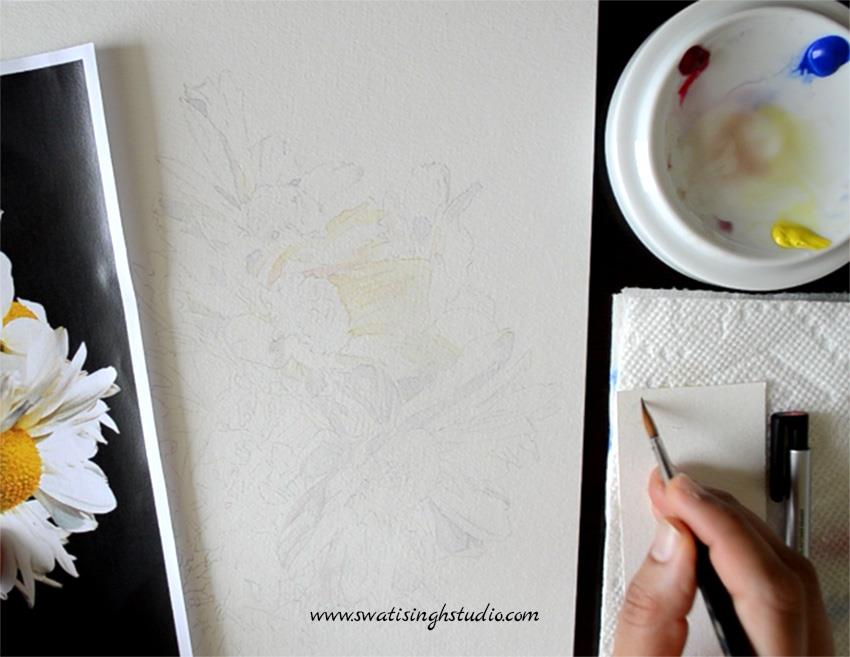
Tip: Test the shade in rough before proceeding further.
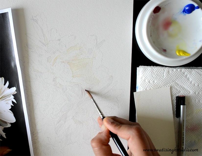
Step 8. Add a glaze of pink to the previously painted blue areas that require a touch of pink.
DARKEST SHADOWS
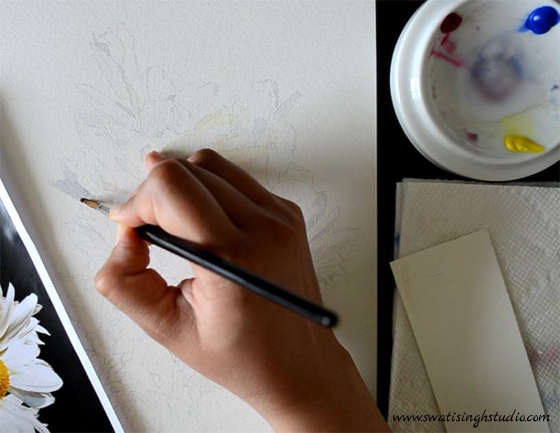
Step 9. Mix a dark bluish gray color (by keeping the water content low) to make the dark shadows stand out from the previously painted ones.
ADDING DETAILS
Step 10. Add veins with the fine tip of your brush.
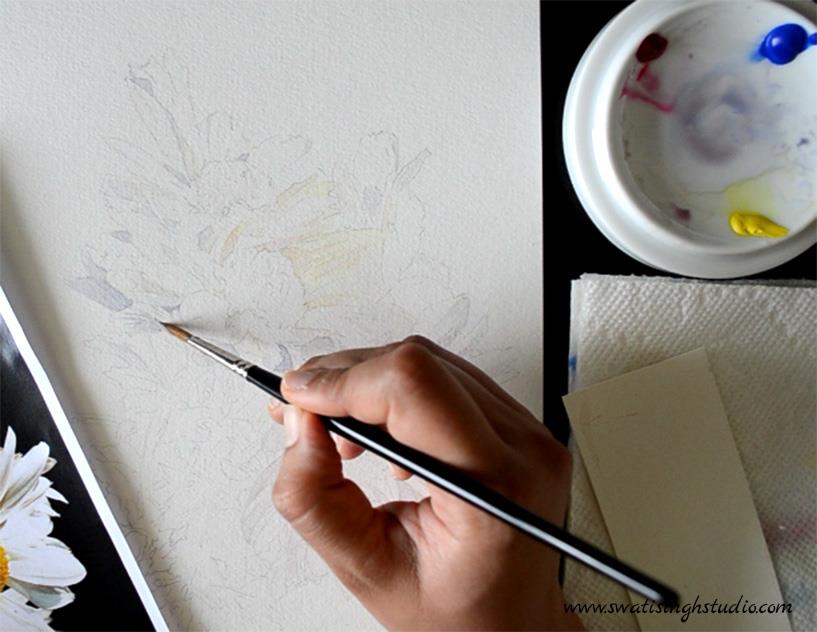
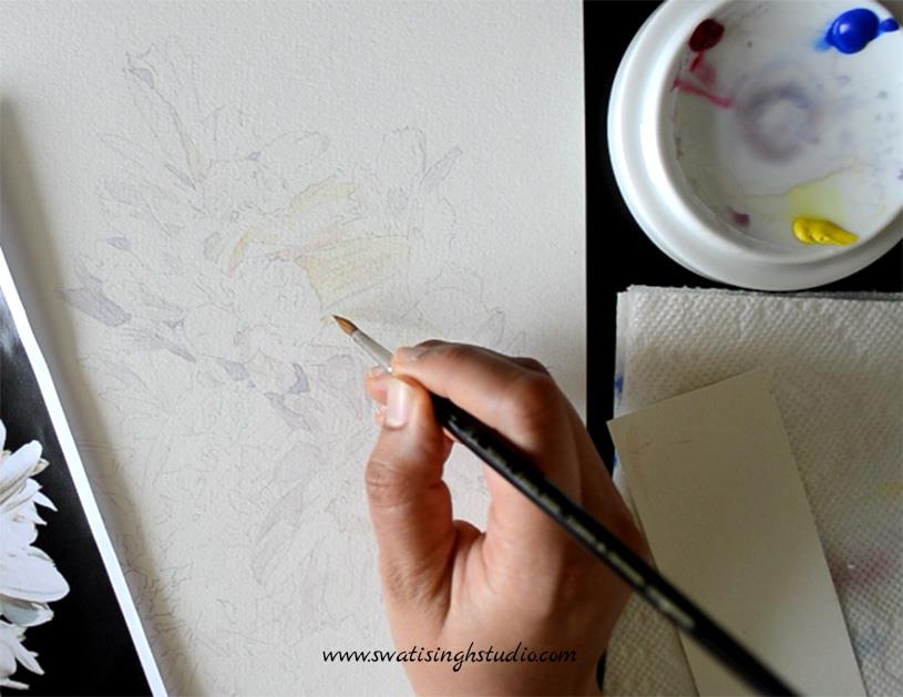
Step 11. Darken any shadows with a second layer of color that need to stand out a bit more.
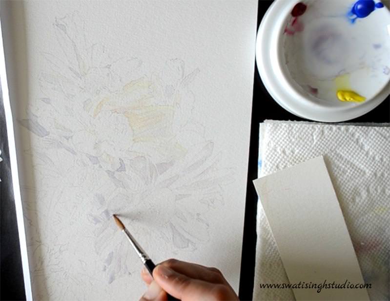
This is it. The first layer of shadows is done. We will leave the shadows here for now and revisit them once the entire composition is painted. This will help in judging the tonal values of the petals better against all the other elements of the painting.
If you liked this tutorial do SUBSCRIBE to my blog and do not forget to visit my Youtube channel where you can see me paint from start to finish without skipping any steps!
If you have any questions regarding the tutorial feel free to e-mail me or contact me through my FACEBOOK PAGE.
In the next tutorial (Part 2) we will be painting the yellow centers of the flowers.
Till then have a wonderful week and happy painting!
Swati